HotDocs Advance Integration > Component Studio > Component Editors and Tools
 Component Editors and Tools
The right side of Component Studio is where you can create and edit the individual components of your component file. This enables you to create most of your components at once and then insert them into a template as needed.
Each component you edit or create opens in its own tab in the editor area of Component Studio. This enables you to work with various components at the same time. Each type of component has its own editor to provide access to the different properties available with that type of component. When you edit the properties, you change how that component behaves during the HotDocs Interview, and how HotDocs Advance assembles the final document.
This topic covers:
Tab Behavior
As you open components for editing, a tab for the component will display at the top of the editor. Once a tab is open, you can interact with the following elements:
-
Component editor tab – Displays both the component type icon and the component in a visual tab, which enables you to perform the following actions:
-
Close a tab by clicking the x button on the currently focused tab. Other opened tabs require you to hover over a tab to reveal the Close button.
-
Rearrange tabs by clicking and dragging a tab left or right within the row of tabs to move it to a new position in the tab row.
-
Move the tab to new window by clicking and dragging on a tab until it "snaps" into its own window (this behavior is also available in the tab's right-click menu)
-
Right-click to open a menu with the following options:
-
-
Close tab – Closes the tab.
-
Close other tabs – Closes all other tabs in the tab group.
-
Close all tabs – Closes all tabs in all tab groups.
-
Move tab to new window – Opens the tab in its own window, enabling you to move the component editor outside of component studio.
-
Pin tab leftmost – Moves and locks the tab to the leftmost position in the tab group (subsequent pinned tabs will pin to the right of previously pinned tabs)
-
Keep tab open – (only available from the "quick access" tab) Moves the tab from the "quick access" tab to the open tab group on the left
-
New horizontal tab group – Moves the selected tab to a new tab group located below the current tab group – available with multiple components open.
-
New vertical tab group – Moves the selected tab to a new tab group located to the right of the current tab group – available with multiple components open.
-
Move to next/previous tab group –Moves the selected tab to the previous/next tab group, available when multiple tab groups are open.
-
Move to main tab group (only available from a tab opened in a new window) Moves the selected tab (opened in a new window) to the most recently opened tab group in the component editor area
-
-
Open tab group – Displays the tabs for any components that has been opened from the main component list via double-click. The open tab group is located at the upper-leftmost position of the editor and can contain as many tabs as you desire.
-
Quick access tab – Displays the tab for any component that has been opened from the main component list via single-click. Located in the upper-right corner of the editor and can only contain a single tab. For example, if you single-click to open another component, the tab will displays the newly selected component (no longer displaying the editor of the previous selection). Keeps your tabs organized and provides you a quick way to make an edit to a component without cluttering your tab groups. For example, you can review the contents of a component editor before deciding to either close or keep the tab open.
Examples
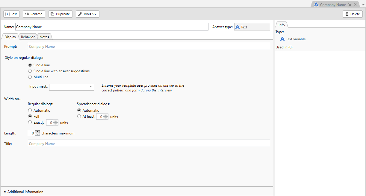
When you select a Text variable  the following editor displays:
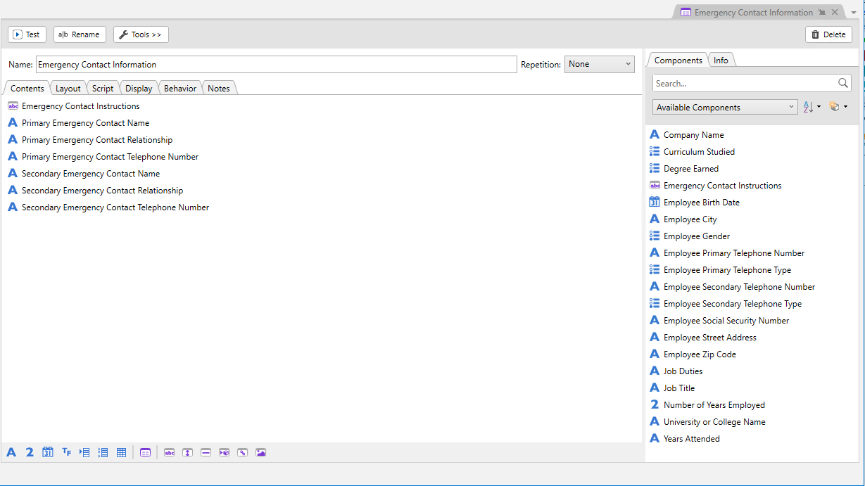
When you select a Dialog  the following editor displays:
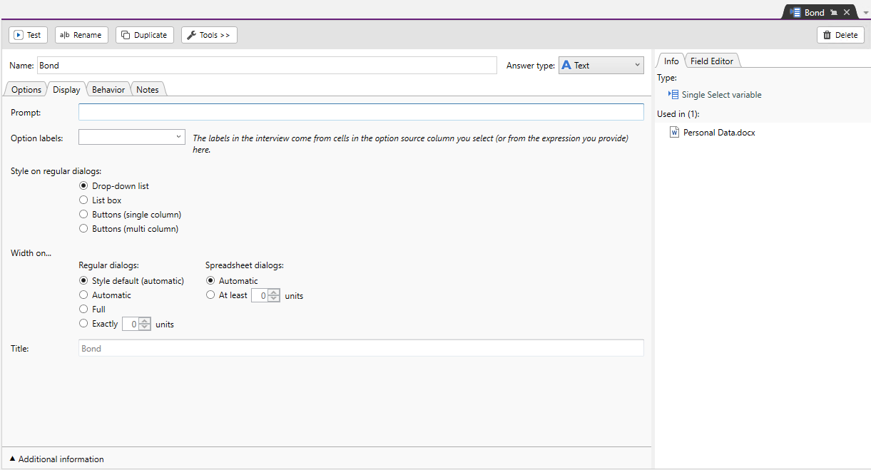
When you select a Single Select variable  the following editor displays:
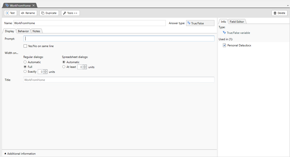
When you select a True/False variable  the following editor displays:
Related Topics
